Step-by-step examples of creating sticker templates
Creating a basic sticker template
Let’s create a sticker template that will add a sunglasses sticker to a user photo (into the eyes area). You can download graphics for this sample template here. The resulting template can be downloaded here.
Open the Template Creator. Select File menu Create Project.
New Project window will open. Select the Sticker template type and New PSD document. Then set the path to your project.
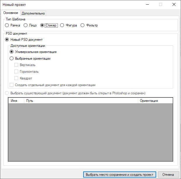
It is important to select the correct template type. A peculiarity of sticker templates is that a user photo is never cropped. Although you can also add stickers in other template types, a user photo will not be cropped only if you select the Sticker template type.
The Template Creator will generate the correct structure for a sticker template. Let’s look at the layers arrangement.
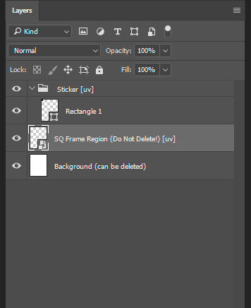
You should place graphics for your sticker into the Sticker group.
Each individual sticker that you create in the Template Creator should be placed into a separate group whose name starts with the word ‘Sticker’ (e.g., Sticker 1, Sticker 2 , etc.). If your template contains only one sticker, then the name of the only group can be just ‘Sticker’.
The sticker group contains Rectangle 1 - you need it only to be able to reparse your PSD document in case you forgot to add your sticker graphics into the sticker group. It should be deleted as soon as you’ve added your graphics into the sticker group.
All layers a sticker consists of are rasterized inside its group. You can apply a blending mode to a sticker group ( see the list of blending modes), as well as apply a mask to it.
The smart object - SQ Frame Region (Do Not Delete!) [uv] - is used for technical purposes only. You can also put test photos inside the Smart Object to try them with your template in Photoshop.
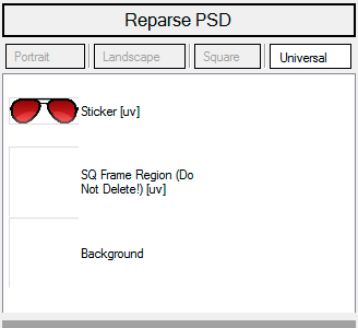
Place the prepared layer with sunglasses into the group named ‘Sticker [uv’]. Delete Rectangle 1.
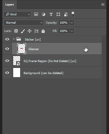
If there is not enough room in the canvas for the sunglasses layer, expand the canvas so that you could fit the sunglasses graphics in.
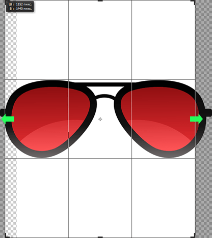
Technically, you could leave the canvas size as is, downsizing the graphics layer instead. However, downsizing a sticker in the PSD document may lead to loss in quality during its automatic scaling or creating subsizes.
Now head back to the Template Creator and reparse the PSD.
When reparcing is complete, select the Frame Region and open its filters. Add the Rasterization filter. Its role is explained later in details.
The panel on the left will now display the sunglasses sticker.
Let’s now position the sticker. Technically, a sticker positioning is performed with the help of the Rasterization filter: its parameters define the sticker position and scaling size.
To access the parameters of sticker positioning in the Template Creator, right-click the ‘Sticker [uv]’ layer to open the context menu, then select Edit rasterization > SQ Frame Region (Do not delete!) [uv > Rasterization ‘Sticker [uv]’] > SQ Frame Region (Do not delete!) [uv].

You can also access this dialog if you choose Manage rasterizations… from the same context menu of the sticker layer, or via the Filter settings dialog that can be opened from the context menu of the Frame Region layer.
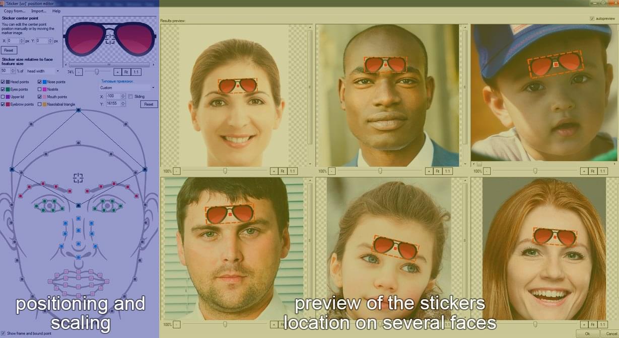
The sticker position editor will open.
The left part of the window displays sticker settings, while the right part shows preliminary results of its positioning.
Let’s start adjusting the sticker by specifying its center point. In the glasses sticker, it is wiser to position it not in its real center but near the nose bridge.
The initial coordinates of a sticker center point are always x=0; y=0. The reference point is positioned in the geometric center of a sticker image. The x-axis is directed horizontally to the right, and the y-axis is directed vertically upward. The center point is defined by the aim icon on a sticker preview.
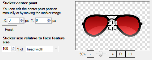
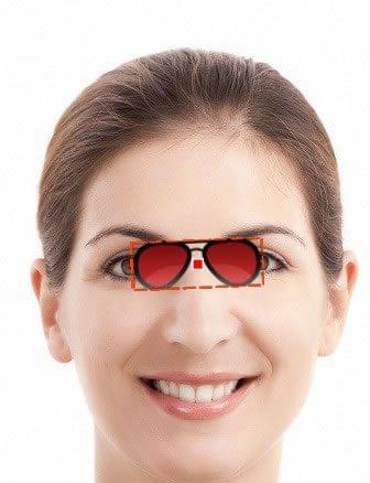
Now move the aim marker to the nose bridge area or edit the center point position by changing the Y coordinate to 195. After that, the preview will look as shown below
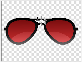
Note that when you reposition the center point, its position does not change in relation to facial features. Its position changes only relative to the sticker image itself.
The next step is sticker scaling. Guided by anthropological reasons, it is best to set the scaling size of the glasses sticker relative to the head width. Let’s set the size to 100%.
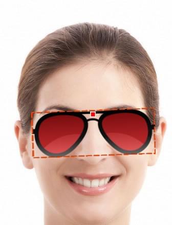
The sticker scaling size is 100% (of the head width)
The next step after adjusting a sticker center point and its scaling is its positioning.
To position a sticker in a certain face area, you need to select one or several marker points on the face scheme and adjust the force of attraction of the sticker to each of them (at least one marker point must be selected).
The Template Creator offers a set of pre-configured bindings for some typical cases of sticker positioning. These default bindings can be found in a drop-down menu above the face scheme to the right of the marker points check boxes.
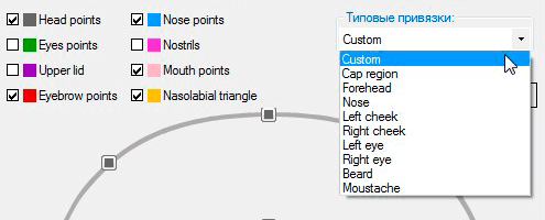
These pre-configured settings do not cover all cases of sticker positioning and cannot guarantee quality positioning for all stickers. However, it is advisable to use them as the starting point and then adjust them for a particular sticker.
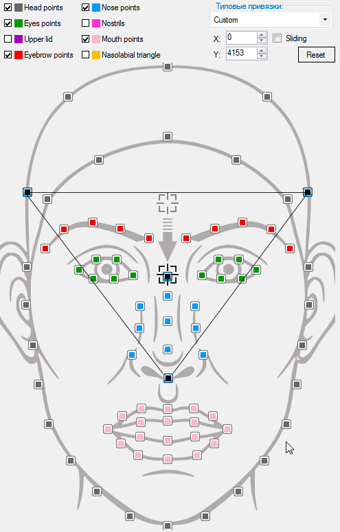
In this particular case it is better to create a custom binding. Select marker points as shown on the scheme below:
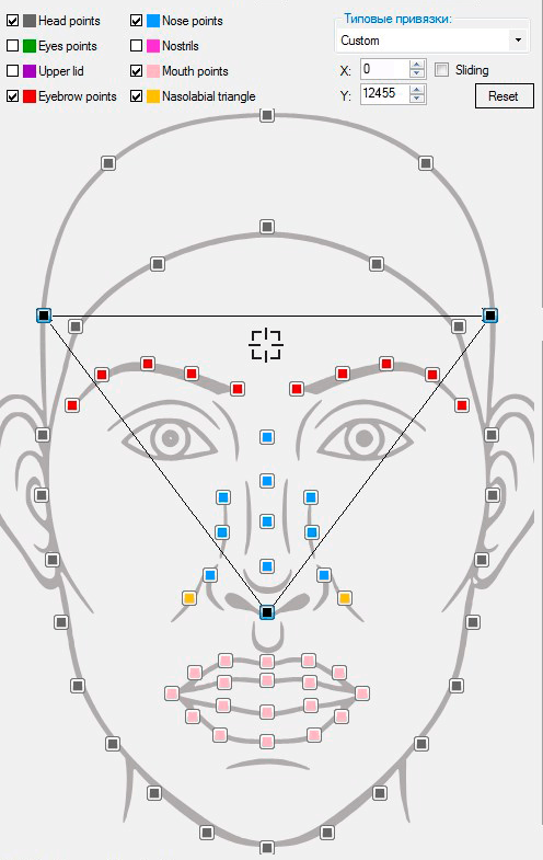
Note that when you select marker points on the scheme they are outlined with lines. The coordinates of the force of attraction aim icon are: X: 0; Y: 20544. This is its default position for the Forehead binding.

You can specify additional marker points inside the resulting polygon, if needed. They will also affect the sticker positioning. In this particular case selecting additional marker points is not needed.
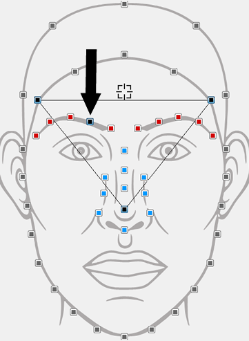
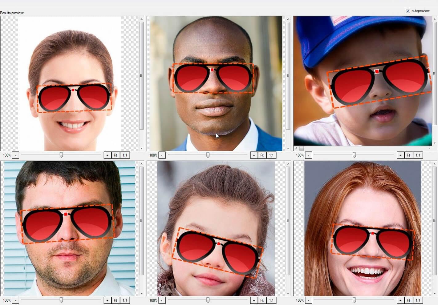
Judging by the previews, the glasses start falling into place.

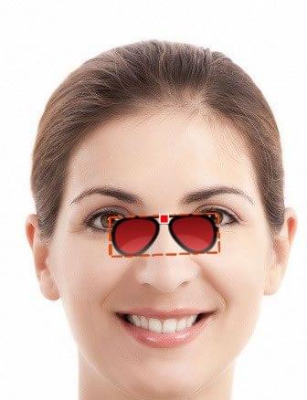
However, if we have a look at other test photos, we can see that not in all photos the glasses are directly on the bridge of the nose yet:
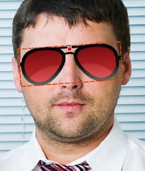
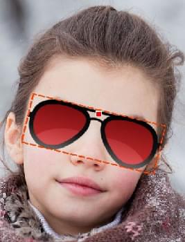
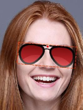
To place them a little lower, you need to adjust the sticker force of attraction to its marker points.
Pay attention to the aim icon on the face scheme. Contrary to what one might expect, it does not specify the exact place where a sticker will be positioned. The aim icon is used to define and adjust the force of attraction of a sticker center to each specified marker point. The closer is the aim icon to a marker point, the stronger is the force of attraction of a sticker to this point.
You can move this force of attraction aim icon either by using your mouse to drag the icon to the desired position or by entering its coordinates in the corresponding field manually.
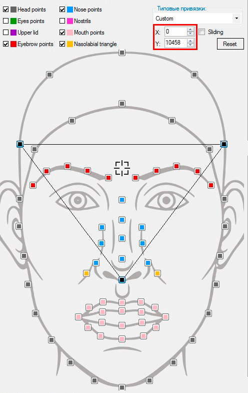
The aim icon of the force of attraction is positioned along the horizontal and vertical axes (X and Y). The axes are directed horizontally to the right and vertically upward, respectively. The origin of coordinates coincides with the bridge of the nose marker point.
The Y-coordinate of the the force of attraction aim icon ranges from -40000 to 40000, the X-coordinate ranges from -26800 to 26800. It is allowed to use whole number coordinates only.
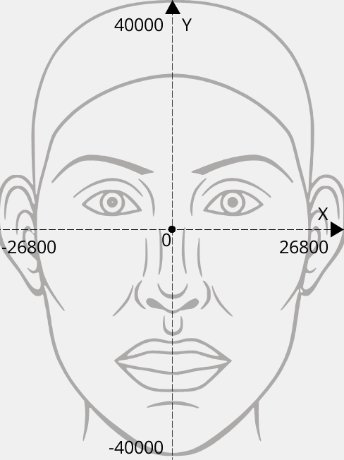
Due to such range of coordinates, it is important to understand that changing the aim position by several units will not result in a notable change of a sticker position in photos with small resolution (including the previews in the sticker position editor). However, changes will be notable in photos with big resolution.
For the current template, you should move the aim icon downward as shown in the screenshot below. Its new coordinates should be as follows: X: 0; Y: 12500. When you move the aim icon down, the force of attraction of the sticker center to lateral marker points (on the left and on the right) becomes weaker; at the same time the force of attraction to the lower marker point becomes stronger.
Judging by the previews, the glasses sticker is in its proper place now.
СNow click OK to save all sticker settings and test the template. You can go back to any step you want to edit sticker settings, if needed.
The resulting template from this section can be downloaded here.
Creating a sticker template with sub-sizes
Experience has proven that the largest user photos processed by templates have 5000 px on the long side. That’s why it is recommended that the sticker original size should be large enough to look good on photos with 5000 px on the long side. For a sticker to look good on smaller photos, you need to create several sub-sizes.
Sub-sizes are usually created by halving the size values. That is, you can create the following sub-sizes for the original size of 5000 px: 2500 px, 1250 px, 625 px. Also, the following set of sub-sizes is commonly used: 3200 px, 1600 px and 800 px. For some templates you may need to experiment with the choice of optimal sub-sizes to achieve high-quality results of user photo processing. The template Creator lets you edit your sub-sizes at any moment.
When a user photo is processed, the closest sub-size is chosen (a bigger or equal size to a given user photo, on the long side). Therefore, if you’ve created a template with 5000 px on the long side and with the following sub-sizes: 3200, 1600 and 800 pixels, they will be applied to different user photos as shown in the table below:
| 800 px sub-size | A photo with the long side up to and including 800 px |
| 1600 px sub-size | A photo with the long side ranging from 801 px up to and including 1600 px |
| 3200 px sub-size | A photo with the long side ranging from 1601 up to and including 3200 px |
| Original template graphics (5000 px) | A photo with the long side exceeding 3200 px |
So, select the Sticker template type in the Template Creator and use the prepared PSD document with a sticker as a PSD document (download it here). The PSD document should be opened before you open the New Project dialogue.
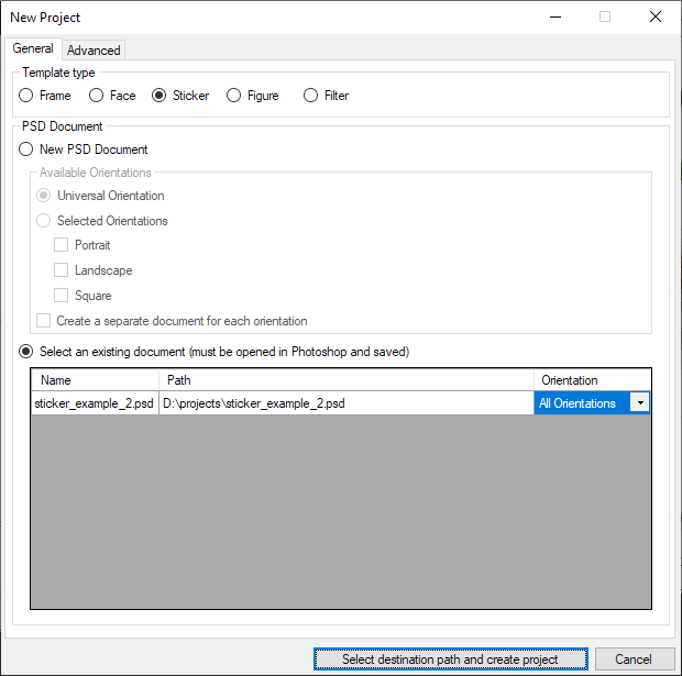
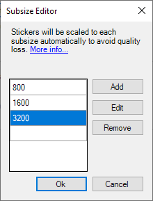
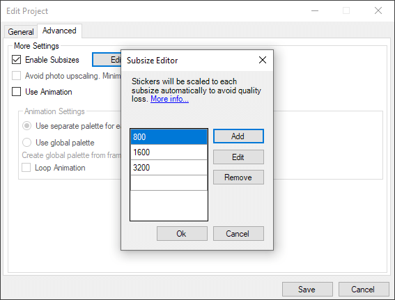
Then, go to the Advanced tab, check the Enable Subsizes checkbox and click the Edit button to open the Subsize Editor.

Use the arrow buttons to the right of the specified size to change its value in increments of 100 pixels. If you need to choose a more specific number (like 1920), you can enter it manually. It is allowed to add up to 5 sub-sizes in a project.
Let’s specify the following sub-sizes in the corresponding block: 800 px, 1600 px and 3200 px.
The next steps are pretty much the same as with other sticker templates.
Reparse the PSD document. The Template Creator will automatically create a set of graphics for each chosen sub-size. A set of graphics with the closest size will be used when processing a user photo.
After you have reparsed the PSD document, you need to position the sticker.
These are recommended position settings:
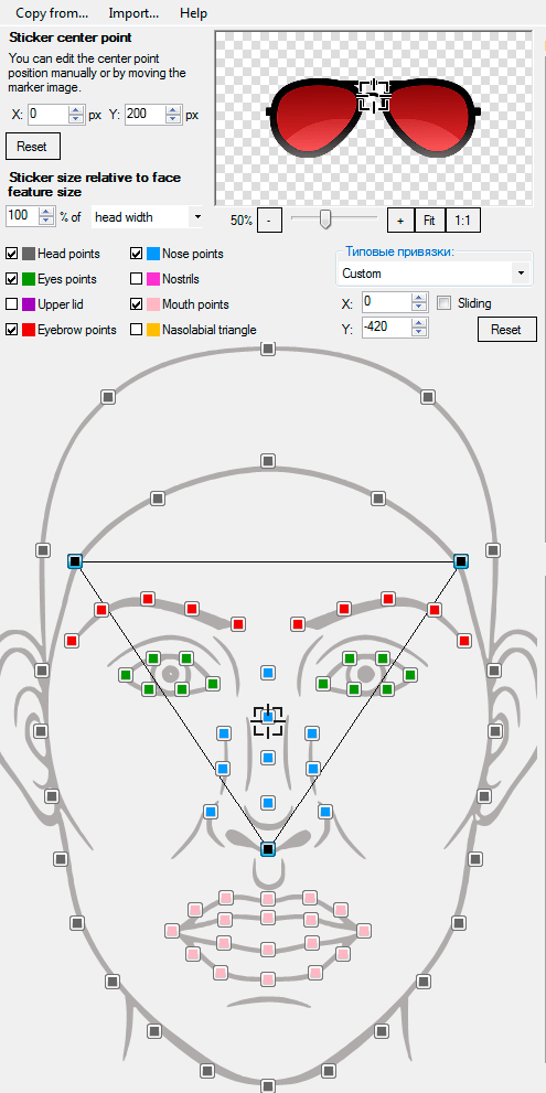
After you have adjusted all the settings, click OK to save them and close the Sticker position editor
Then test the template using different test photos. In the upper right corner of the Template Creator there is a checkbox letting you filter photos by size.
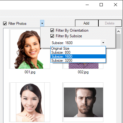
When filtering test photos, you can choose filter values that coincide with the sub-sizes specified in your template.
After choosing test photos that match the specified sub-size, you can see results of processing with the specified sub-size.
All test photos have pop-up hints showing the size of the photo in pixels, as well as the sub-size that will be used when processing this photo.
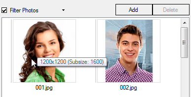
Make sure the sticker is displayed correctly in the template. To do so, apply it to several photos for each sub-size (800, 1600, 3200, original size).
Click the ‘Export Results’ button to save the results and then save the project.
To see the difference between sticker templates created with and without sub-sizes, make a template based on the same PSD document, but without sub-sizes.
Process the same user photos (which you processed with a template that contained sub-sizes) and compare the results:
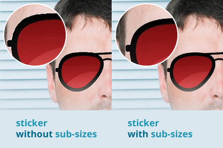
As you can see, the sticker looks low quality and has jagged edges in a template without sub-sizes.
You can edit / add / remove sub-sizes in your existing sticker templates. To do so, go to the File menu, and select Edit Project.
Make the edits you need in the Sub-sizes Editor dialog and save the changes.
You will be given a message saying that you need to reparse the PSD document.
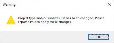
This has to be done to update the list of sub-sizes and generate the updated resources all over again.
The resulting template from this section can be downloaded here.
Creating a template with symmetrical stickers
Sometimes you need to position stickers symmetrically relative to the vertical axis of the face.
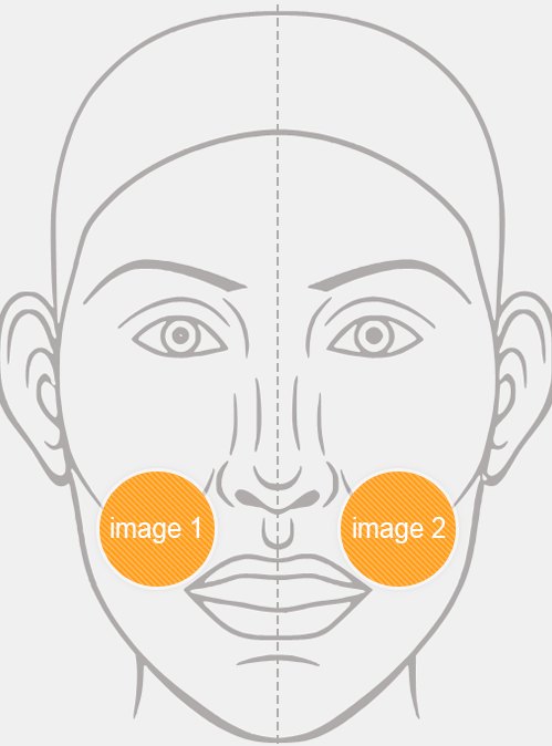
This can be done in two ways:
Method 1: Place both objects into one sticker and position / scale it only once relative to a marker point on the centre line.
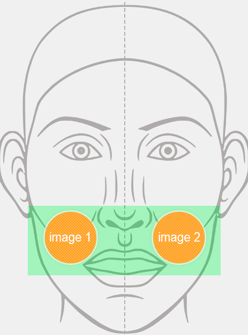
This method does not work properly in cases when the face in a user photo is asymmetric (e.g. due to strong facial gestures - eyewink, raised brow, etc). In such cases images placed into one sticker will not be positioned correctly in relation to face features.
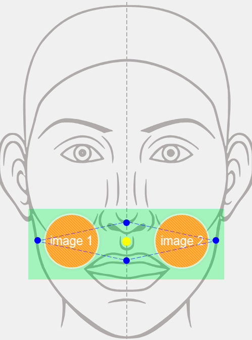
Method 2: Place each image into a separate sticker. Position one sticker first, then mirror its position settings in relation to the vertical axis and transfer them to the other sticker.
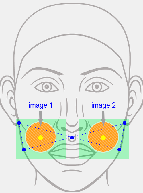
The 2nd method lacks the limitation mentioned before, as each of the two stickers will be positioned individually, using its own binding points. That’s why this method is advisable.
How to use this method:
- Adjust the first sticker center point, set its scaling size, select the marker points and adjust the force of attraction. Save the changes.
- When you are content with the results of adjusting the settings mentioned above, open the position editor of the second sticker. Copy the settings using the Copy from... menu.
- Set the marker points for the sticker in the mirror image.
- Enter the coordinates for the force of attraction of the sticker center to the marker points. Note that the x-coordinate (the horizontal axis coordinate) should be entered with the opposite sign (e.g., if the coordinate was ‘1010’, then you should enter ‘-1010’).

Modifying Sticker Color To Match Skin Color From User Photo Using Filter "Eyedropper By Mask"
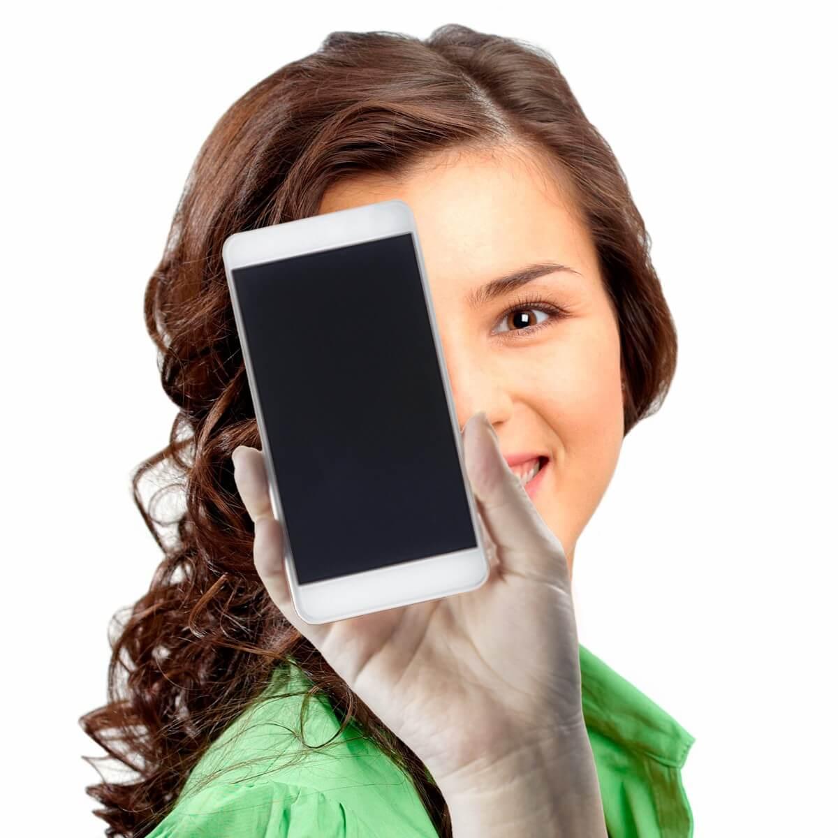
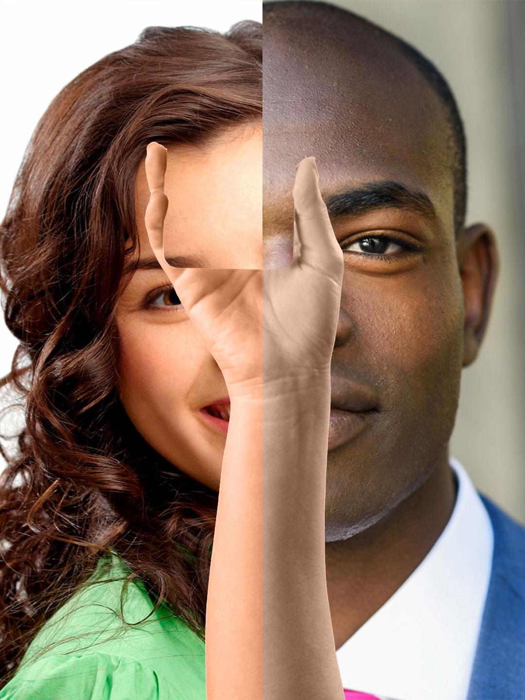
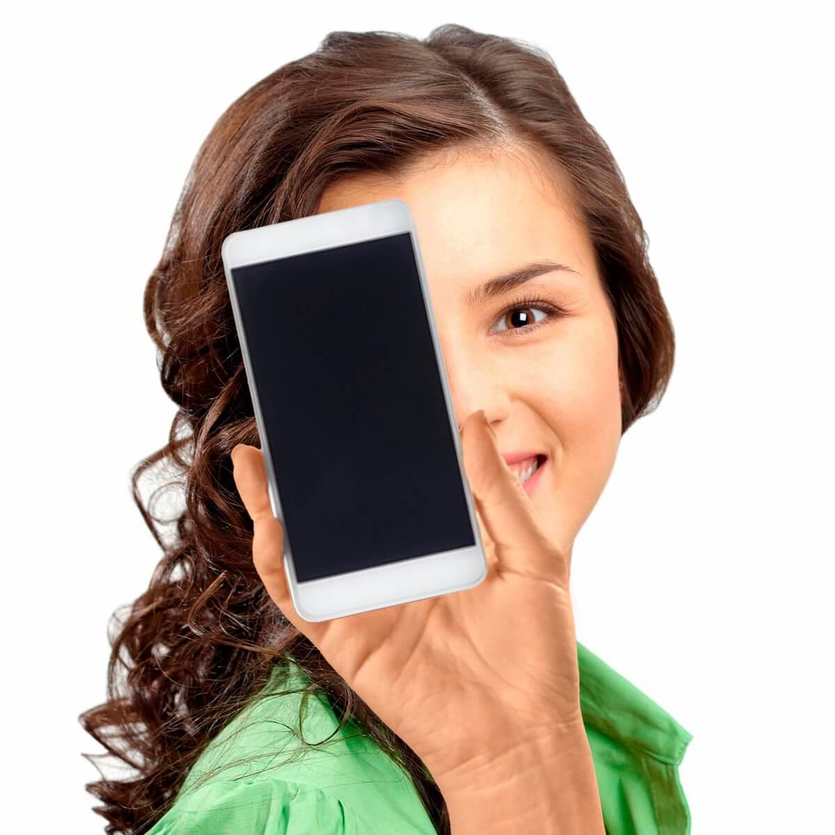
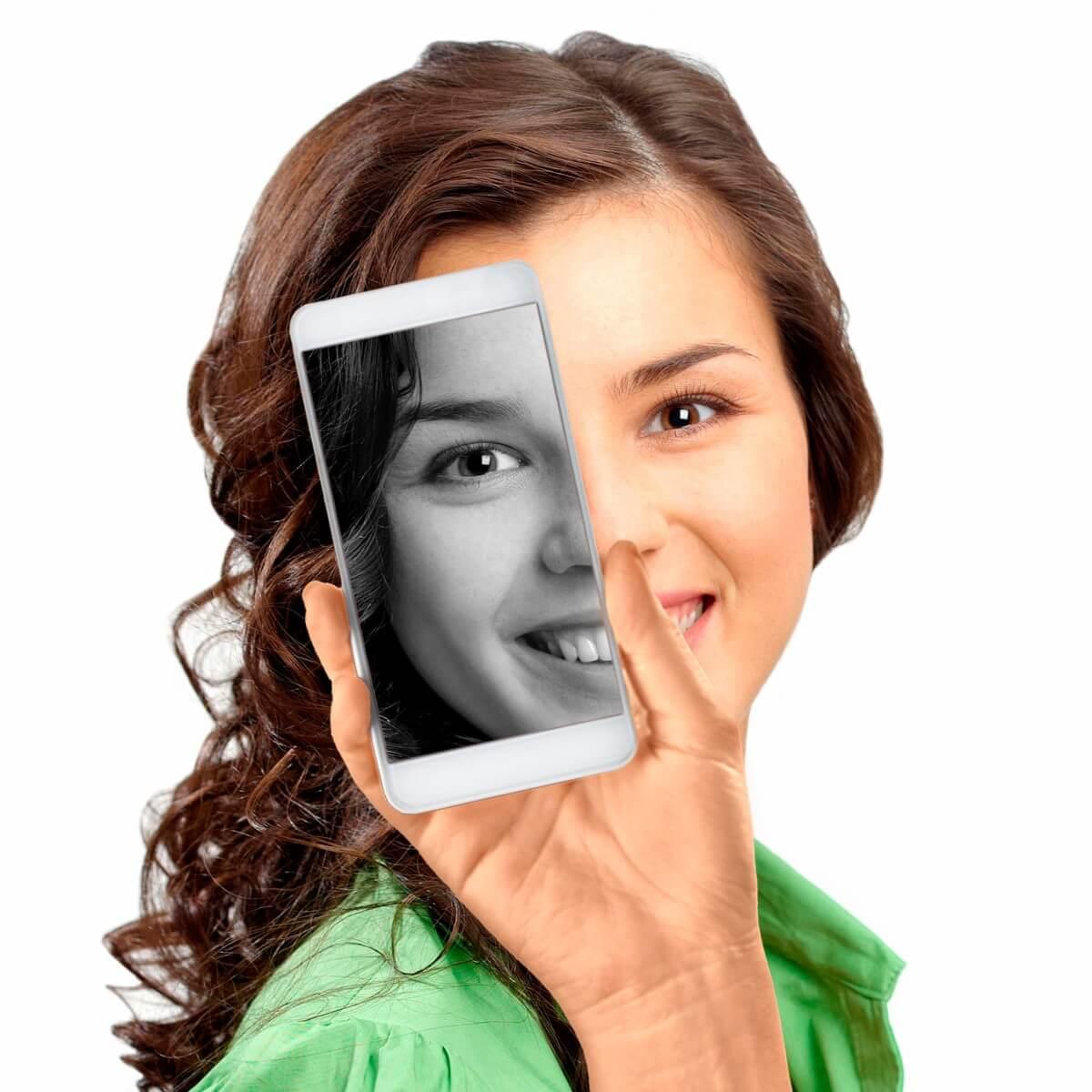
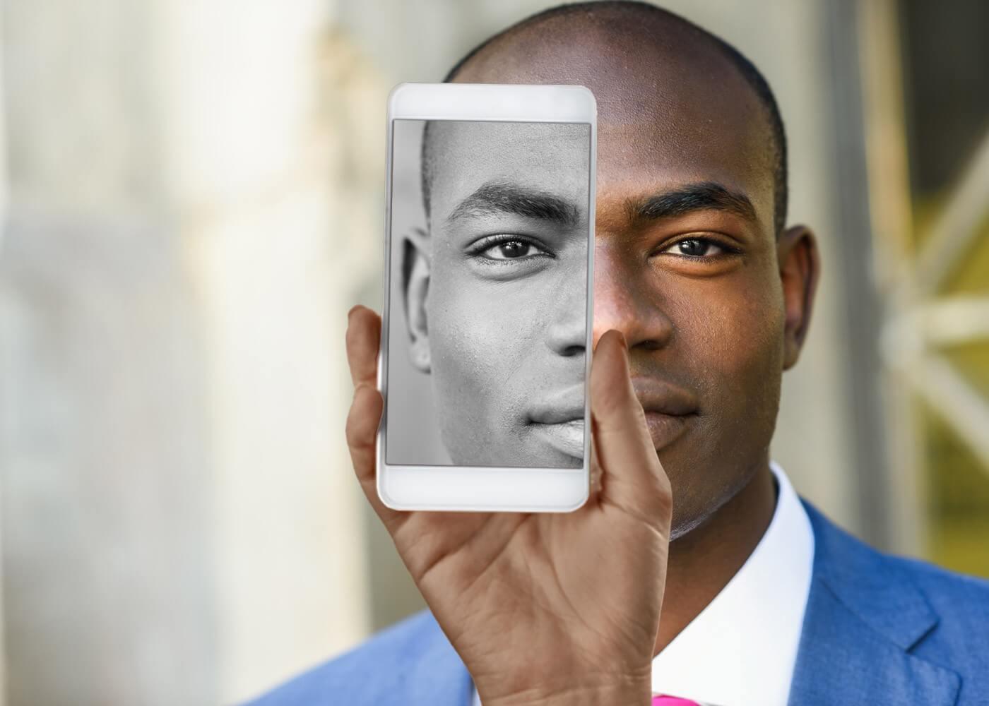
In this lesson you will learn how to work with the filter Eyedropper By Mask using as an example a template with sticker that will be painted with color of the skin from a user photo. We'll try to achieve this result using different approaches to editing the sticker.
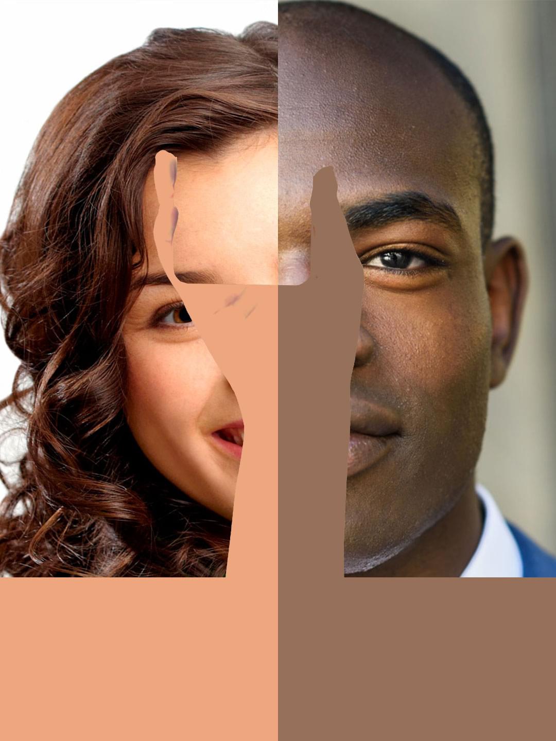
| Source Photo | Resulting Photo |
|---|---|
 |
 |
 |
 |
You can download the project for the lesson here.
We have a template with the following structure:
- Image of a hand separated into three stickers: a hand, a phone frame, and a phone screen.
- Frame Region.
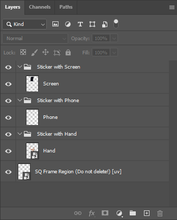
The sticker with hand will be painted with the skin color from a user photo. The sticker with screen will contain the black and white copy of the user photo. The sticker with phone frame is only needed to complete the composition. We will not change or modify it in any way.
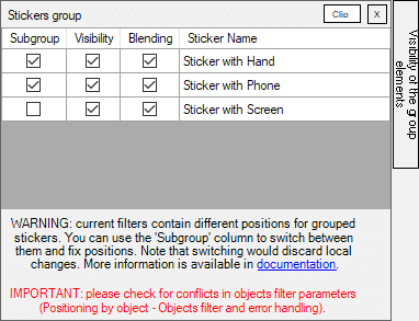
Layers with these stickers are grouped in Photoshop so the Template Creator could consider them as a whole. You can learn more about grouping stickers from this article..
If you want, you can use your own image of a hand. For a better result it has to be a universal hand, preferably with fair skin, for which it is difficult to determine gender, without nail polish.
Step # 1
First of all, let's add the rasterization filter for the stickers, so we could see them in our project. There's only one Frame Region in the project and we apply all the rasterization filters to it.
Let's start with positioning the Sticker with hand using the following pararmeters:
- Sticker Center Point X: 118
- Sticker Center Point Y: 509
- Sticker Size: 90% of head width
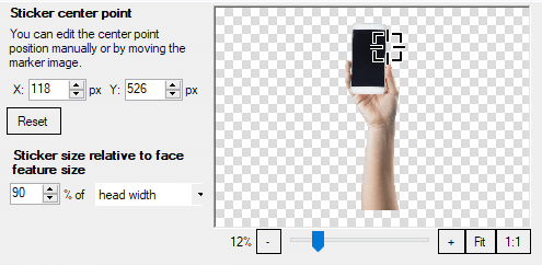
All the other parameters are left untouched in their default values:
- Marker Points: default (between the eyes)
- Force of Attraction marker coordinates: X: -100; Y: 16155
Next, add the rasterization filter for the Sticker with Phone and Sticker with Screen. It will be easier to choose their position from the "Visibility of the group elements" block, by checking the box next to a sticker positioned earlier.
Step # 2
Add to the Frame Region the Eyedropper By Mask filter with the following parameters (default values):
- Mask: Skin Mask;
- Color Measurement Method: median.
Please note, that this filter has to be on top of the list.
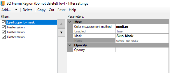
It is very easy to understand how it works: the filter calcualtes a certain color from the given area and fills the whole Frame Region with the calculated color. The area of a user photo used to calculate sample color is set in filter settings.
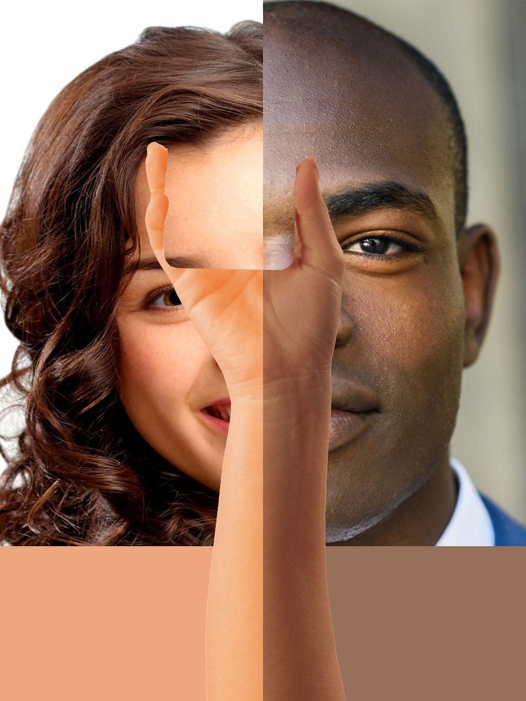
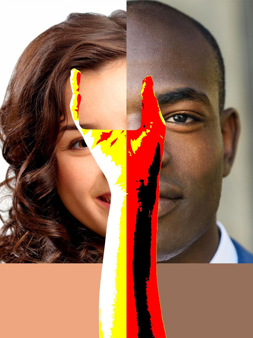
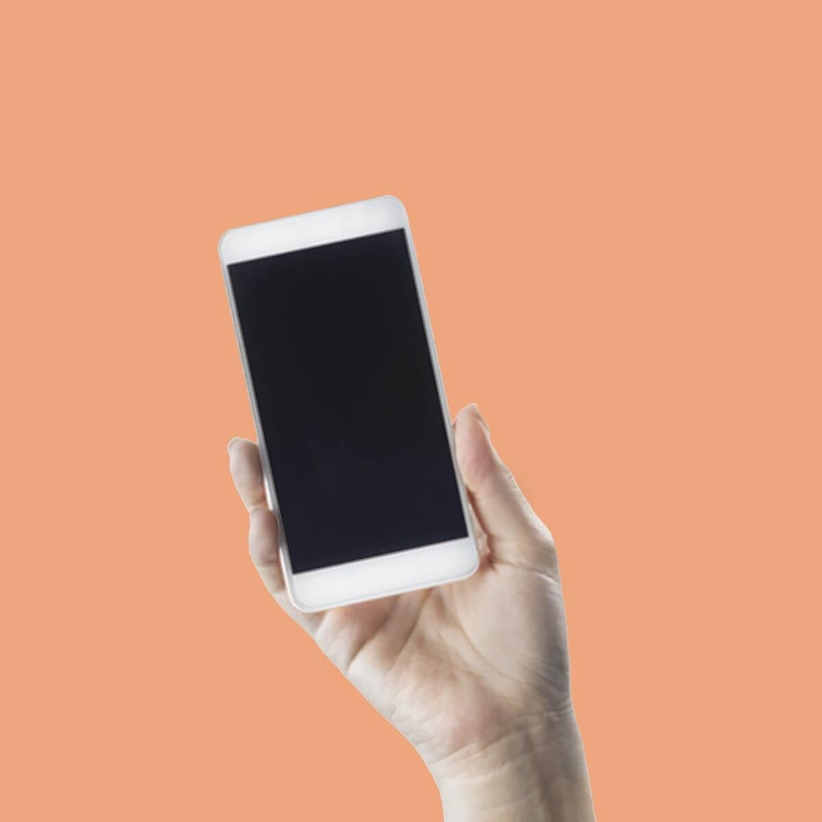
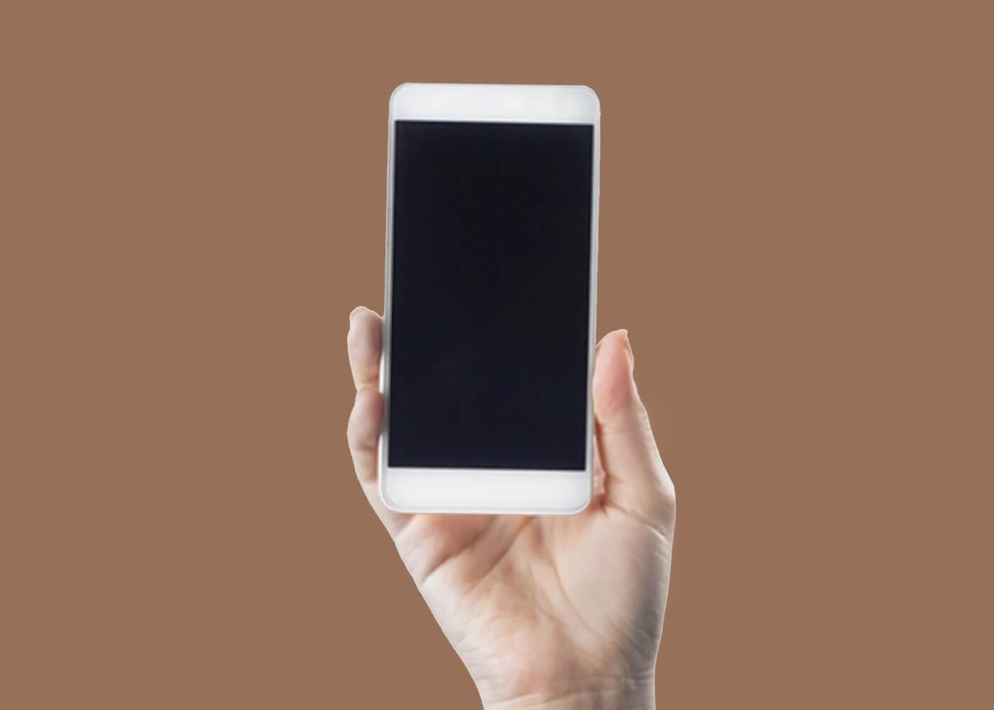
If you get back to the main window and process any photo, the result will be a whole area of a user photo painted with one color with the sticker on top.
| Source Photo | Resulting Photo |
|---|---|
 |
 |
 |
 |
Step # 3
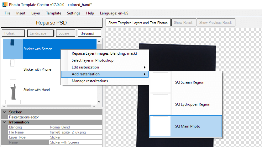
As you can see from the resulting photo, the frame region with Eyedropper completely coveret the photo. We want to see it only on the hand image. To do this let's add a new Frame Region from the Insert menu, name it SQ Main Photo and place it on the bottom of the structure.
Rename the current SQ Frame Region to SQ Eydropper Region and reparse PSD in Template Creator.
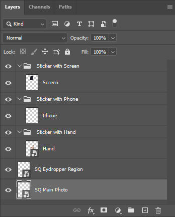
When reparsing is done, open the dynamic mask application settings of the SQ Eydropper Region and create the Sticker Mask based on the same layer.
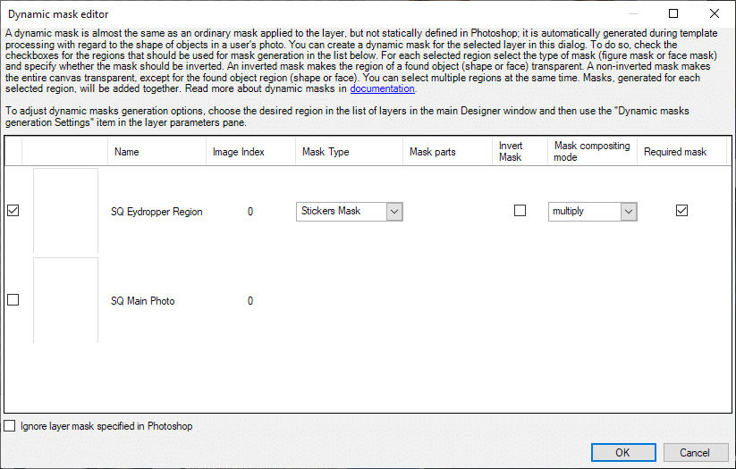
Process the photo again. Now you can see the source photo, but the layer with the Eyedropper by mask filter is covered with the hand image.
Step # 4
Now you need to paint the hand with the color of the SQ Eydropper Region layer. It makes sense to do this using blending modes.
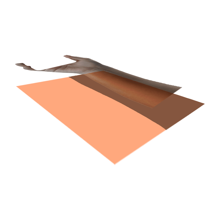
There are two options of placing the layers:
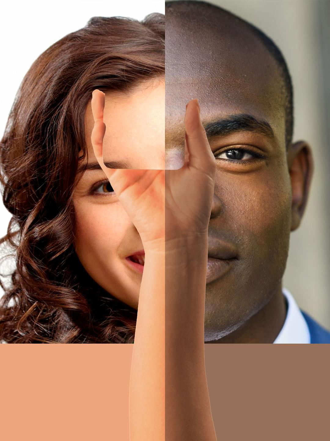
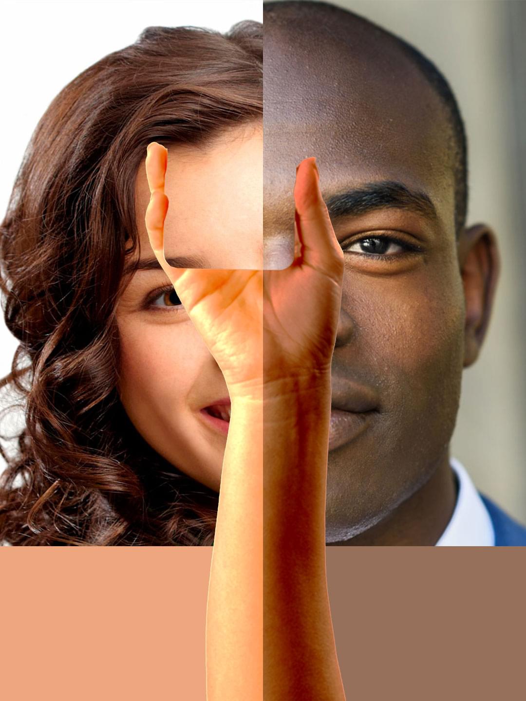
| Layer with eyedropper is on the bottom, hand image with blending modes is on top | Hand image is on the bottom, Layer with the eyedropper filter is on top |
|---|---|
 |
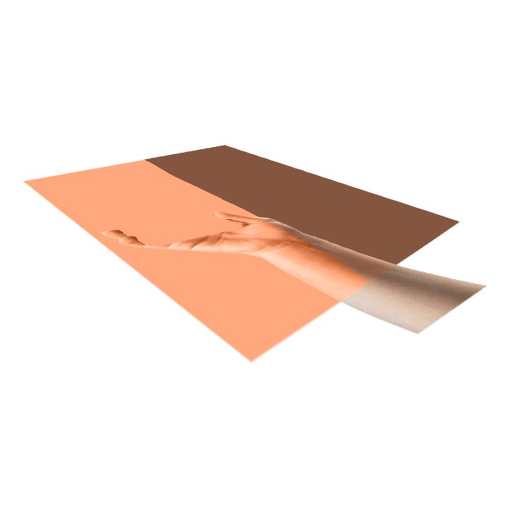 |
The two-tone layer found in the image is a combination of resulting photos when we applied the filter Eyedropper by mask to test photos. You cas see these results in the table in the Step #2.
Usually when we need to paint something we apply the Color blending mode to that layer which will be the source of color.
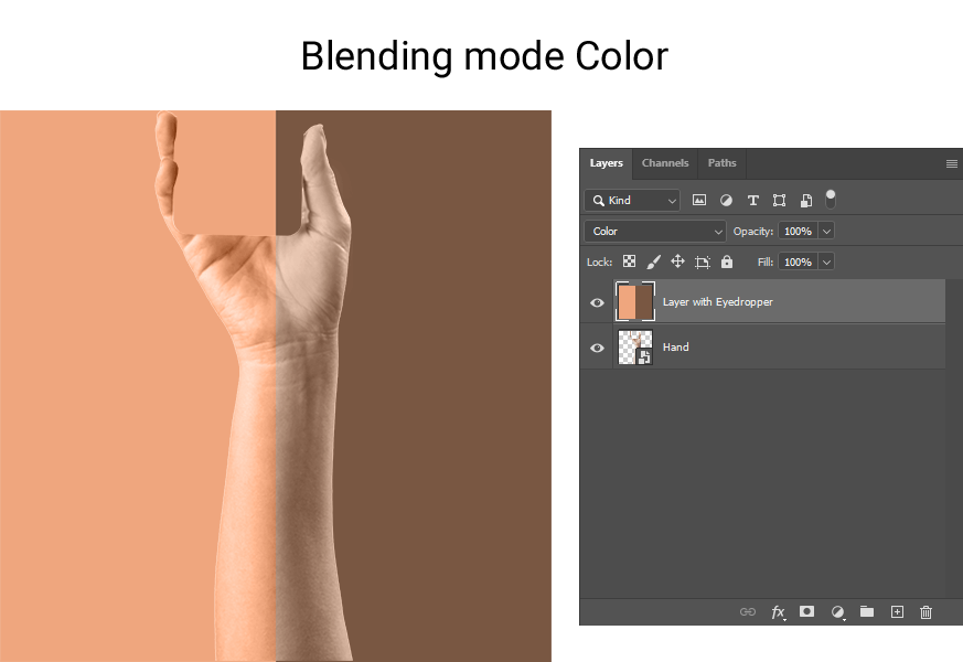
However, the reality is that this blending mode only changes tint of the hand and doesn't affect brightness, so it will not look good on dark skin, despite it looks perfect on light skin. This mode will work symmetrically with the image of a dark hand: dark hand + color mode gives a good result on dark skin, and looks bad on light skin. We come to the conclusion that this is not a viable option.
At this stage let's remember how do blending modes work and think what do we want to achieve. In fact, we need to combine correctly the color and the volume. Volume is the manifestation of highlights and shadows on surface. With this understanding we will choose blending modes.
All blending modes divide into several groups:
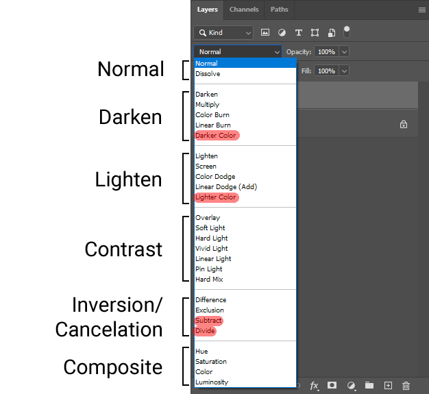
Blending modes not supported by Template Creator are highligted in red: Darker Color, Lighter Color, Substract, Divide. The rest can be used.
Darken modes will only give shadows, without highlights. Lighten modes will give highligts. These are not an option for us. We have already tried composite modes and they didn't fit. Comparative modes are definitely not for this project, but contrast modes, which are hybrid of darken and lighted modes and can manifest moth highlights and shadows is what we really need.
Then we need to search through these modes to find the most suitable result.
As shown in examples, the most suitable blending modes are Overlay and Hard Light.
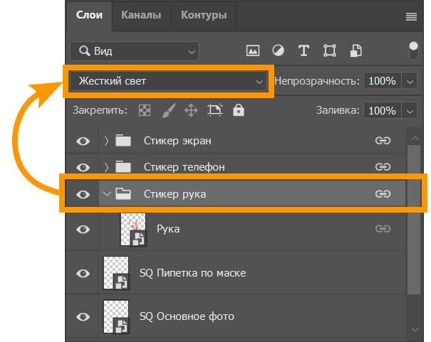
We reduced brightness and contrast of the layer with hand by about half (brightness: -60, contrast: -25), to achieve the best result.
While these are the best results and can be used, they are not perfect: you can't achieve equal contrast on dark and light skin. Light skin turns out to be overexposed, and dark skin lacks some contrast.
Step # 5
In order to improve the result we got in previous step, let's use the Frequency Separation Technique. This technique is often used in photo retouching to quickly correct skin imperfections. The image is separated into two layers: texture and color and you edit these layers separately. We already have the layer with color: it is the layer with the Eyedropper by mask filter, so we only need to create the texture layer.
To create texture from the layer you need only three things:
- Filter Curves with certain values;
- Filter High Pass;
- Blending mode Linear Light for this layer.
Additionally, adjust hue and saturation to create plausible shadows and contrasts.
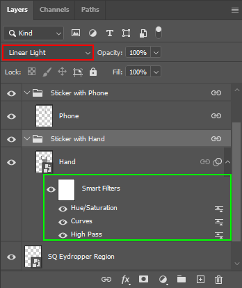
Go to Photoshop and add to the Hand layer successively the High Pass filter and Curves to reduce the contrast, as well as the Hue/Saturation smart filter. Then for the group Sticker Hand set the blending mode Linear Light. Thus, we've separated the texture. The hardest thing at this point is to select the correct values for the texture to make it look natural on any skin color. In our example we have used the following values:
| Curves | High Pass | Hue/Saturation |
|---|---|---|
|
White point
Black point
|
Radius: 30 px |
Hue: -11 Saturation: -50 |
The values here are not universal and should be chosen individually on a case-by-case basis. The most convenient way to do this is to put a two-tone layer as in the examples above.
Return to Template Creator and reparse PSD, to test the current version of our template.
The result is acceptable.
Step # 6
There is little left to do: make the phone screen show the black and white image of a user photo.
Add a new Frame Region using the Insert menu and name it SQ Screen Region. Place it on top of all user photo regions we have in the template. In Template Creator apply the Desaturation filter to it.
Add a new rasterization filter to the frame region SQ Main Photo for the Sticker with Screen. The easiest way to position it is to use the menu Copy from... in the Sticker Position Editor and choose any previously positioned sticker as they all have the same position.
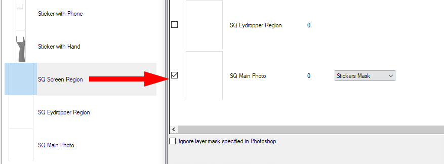
Add a sticker mask to the frame region SQ Screen Region built by the region SQ Main Photo.
Let's process photos and check the result.
